Pretty In Peach - by JDZ Designs
A conversation with head designer at JDZ Designs.
We love this space, and so does Instagram. Can you tell us about the mood you were trying to achieve with this space?
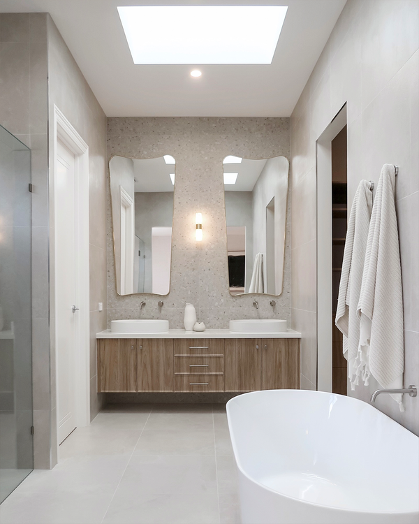
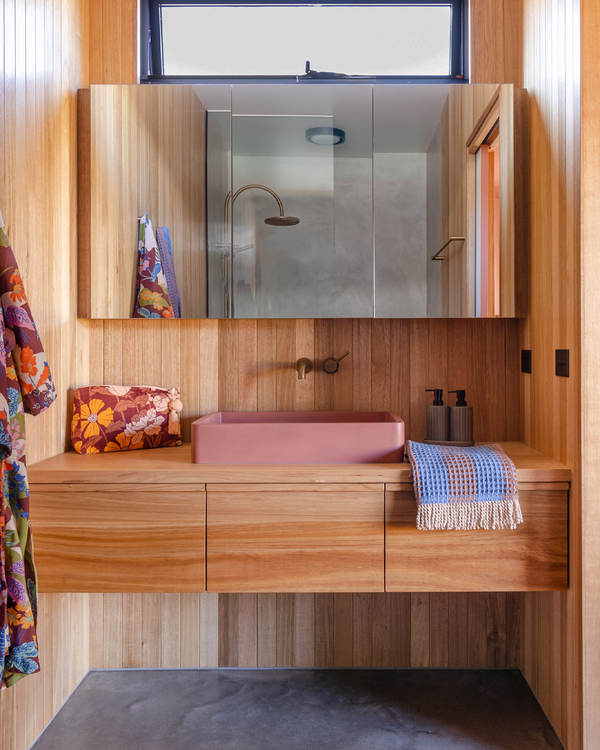
I love this space too, I was so excited when the client and myself discussed the initial brief, it was to be fun and have this understated elegant retro vibe to it. Essentially, the mood was to be one, fun, happiness and softness all at once. It was not to be a typical bathroom experience when opening the door, it was to have a “wow” element to it. As it is the only one in the house, it was essential that it mirrored the same vibe as the kitchen and living area but had its own unique presence.
Tell us about how the colours, patterns, material choices for this space and how they work together?
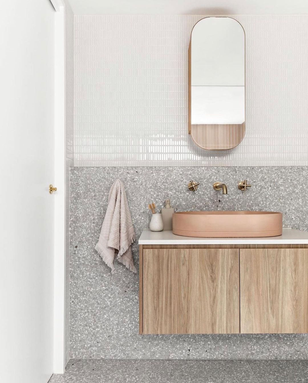
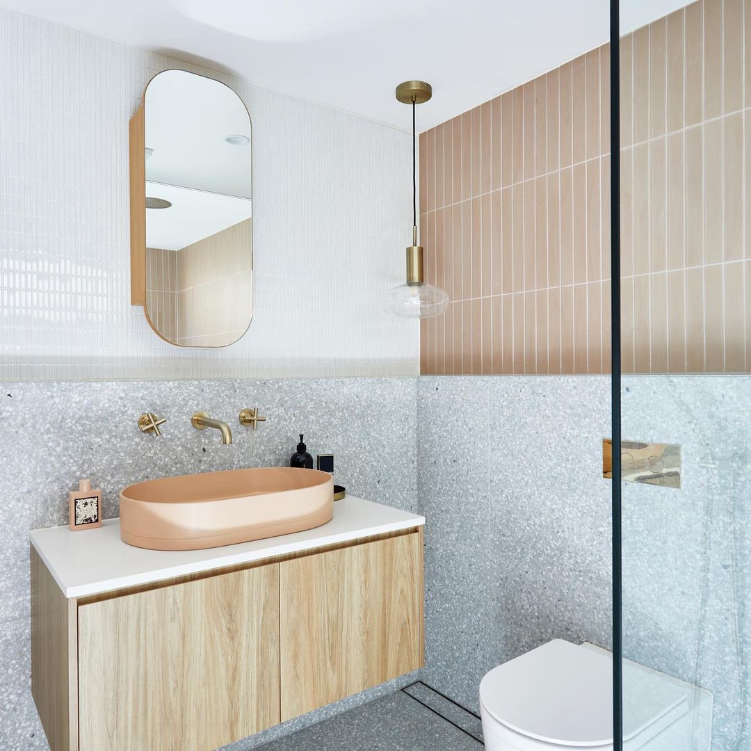
When we sat down to discuss the bathroom, it was already set in the mind of the client to use a combination of the Technicolour Powder ( soft blush pink ) and a Terrazzo, however we had to really think about scale, where they would go in the space and how all the patterns and shapes would relate to one another. Initially there was another Fibonacci Terrazzo colour up for consideration, however Flannel Flower was released, and it soon became the one. It added a lot of warmth and understated elegance to the palette.
We then looked at how that would work with the rectangular nature of the Techni colour, what orientation it would be installed and how it related to the brass tapware. We needed a third tile and it made sense to just go with a simple white gloss to offset and not compete with the other elements of the room. It was important to me that the scale of the third tile related to the Techni colour but didn’t overpower it, hence why the Kit Kat Luminosa was the perfect match. It gives the illusion that it’s a white wall but up close, it has beautiful simple detail to it.
Related Articles
Bold Lines and Natural Textures: A Glimpse into Moonee Ponds Residence
HAAUS Reveal a Palm Springs Inspired Australian Home
Sustainable Living: Introducing the Boutique-Hotel Inspired Good Day House.